
ワードプレス テーマ Twentysixteen カスタマイズで、写真・イメージが、全幅となるような、固定ページを準備しました。
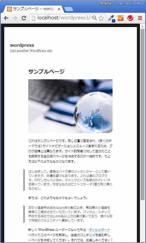
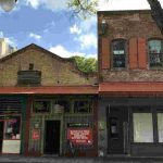
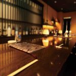
仕上がりは次のとおり
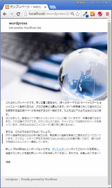
カスタマイズ前のイメージは次のとおり
- 注:
- ワードプレスダウンロード時に、もともと存在しているサンプル・ページを使用しました。
- 前もって、投稿の一番上に、適当に写真を追加しています。
- 投稿内自動<p>を、functions.php で無効にしています。(今回のカスタマイズとは特に関連はありません。)
- 子テーマを作成し、子テーマ上でカスタマイズしています。
- 全幅固定ページ用テンプレートファイル(full-width)を選択した固定ページのみ対応するようにしました。
- 順序:
- 全幅固定ページテンプレート作成し、該当固定ページの投稿編集ページで「full-width」を選択
- スタイルシート修正
- 投稿内に、タグ<div class=”article-inner”>を挿入し、記事はそのタグ内に。全幅にしたい写真はこのタグの外に埋め込む。
1. 全幅固定ページテンプレート作成
- 作業手順:
- page.phpをコピーして、full-width.phpを作成
- Template Nameをファイル上部に、下記のように記載
- 36行目「get_sidebar()」を無効化
- 目的:
- 全幅に設定したい固定ページのみを対応するように、「full-width」テンプレートを設定
- サイドバーが必要ないので削除
<?php
/**
 * Template Name: Full Width
 *
 * The template for displaying pages without sidebar
 * Original is page.php, eliminating get_sidebar()
 *
 */

get_header(); ?>

<div id="primary" class="content-area">
	<main id="main" class="site-main" role="main">
		<?php
		// Start the loop.
		while ( have_posts() ) : the_post();

			// Include the page content template.
			get_template_part( 'template-parts/content', 'page' );

			// If comments are open or we have at least one comment, load up the comment template.
			if ( comments_open() || get_comments_number() ) {
				comments_template();
			}

			// End of the loop.
		endwhile;
		?>

	</main><!-- .site-main -->

	<?php get_sidebar( 'content-bottom' ); ?>

</div><!-- .content-area -->

<?php /* get_sidebar(); eliminated */?>
<?php get_footer(); ?>
2. スタイルシート修正
/*
 Theme Name: Twenty Sixteen Child
 Theme URI: https:/mtac.jp
 Author: MTA Inc.
 License: GNU General Public License v2 or later
 License URI: http://www.gnu.org/licenses/gpl-2.0.html
 Text Domain: twentysixteen
 Template: twentysixteen
*/

/**
 * 11.0 - Content
 */

.page-template-full-width .site-inner {
	max-width: 9999px; /* 1320px */
}
/**
 * 11.1 - Header
 */
.site-header {
	padding: 0 7.6923%; /* 2.625em 7.6923% (note1)*/
}
/**
 * 11.2 - Posts and pages
 */
.page-template-full-width .entry-header {
	display: none; /* (note2) */
}

.page-template-full-width .entry-content,
.page-template-full-width .page-content {
	margin-right: 0; /* 7.6923% (note3) */
	margin-left: 0; /* 7.6923% (note3) */
}
.page-template-full-width .article-inner {
	margin-right: 7.6923%; /* new (note4) */
	margin-left: 7.6923%; /* new (note4) */
}
/**
 * 11.6 - Footer
 */

.page-template-full-width .site-footer {
	background-color: #eee; /* new (note5) */
}

/**
 * 14.1 - >= 710px
 */

@media screen and (min-width: 44.375em) {
	body:not(.custom-background-image):before,
	body:not(.custom-background-image):after {
		height: 2px; /* 21px (note1)*/
	}
	.site {
		margin: 0; /* 21px (note3) */
	}
	.page-template-full-width .post-thumbnail,
	.page-template-full-width .entry-content,
	.page-template-full-width .entry-summary,
	.page-template-full-width .page-content {
		margin-right: 0; /* 23.0769% (note3) */
	}
	.page-template-full-width .entry-footer {
		margin-right: 0; /* new (note3) */
		margin-left: 0; /* new (note3) */
		padding: 0 4.5455%; /* new */
	}
	.page-template-full-width .article-inner {
		margin-right: 4.5455%; /* new (note4) */
		margin-left: 4.5455%; /* new (note4) */
	}
}

/**
 * 14.3 - >= 910px
 */

@media screen and (min-width: 56.875em) {

	.page-template-full-width .site-content {
		padding: 0; /* 0 4.5455% (note3) */
	}
	.page-template-full-width .content-area {
		width: 100%; /* 70% (note3) */
	}
}
- note説明
- 全幅カスタマイズとは関係ないが上下paddingサイズが大きいため削除
- 投稿タイトルを未表示設定(全幅カスタマイズとは関係なし)
- オリジナルで設定しているマージンを無効化し
- 記事内記載のタグで、新たにマージン設定
- フッター 背景色設定(全幅カスタマイズとは関係なし)
ご注意:
当記事は、あくまでも、自社内ページ作成を目的として、メモとして掲載したものです。よって、そのまま利用すると正しく表示されない可能性がありますので、ご了承ください。
2016年8月30日追記:下記の方が、もう少しだけ面倒くさくないかもしれません。
全幅の写真、画像を設定する為、左右マージンがマイナス設定の div タグを設置する。そして、その内部に、先程の左右マージンを相殺した左右マージンを設定した div タグを設置して、その内部に記事を入れ込みます。
- 全幅固定ページテンプレート作成(上記と同じ)
- 投稿内に、タグ<div class=”article-outer”>を設定し、全幅にしたい写真はこのタグ内に。その子として<div class=”article-inner”>を。記事はこの中に。
- 下記スタイルシートを作成する
/**
 * 0.1 - Original ( page full-width inside of articles )
 */
.article-outer {
	margin-left: -9.0908983%;
	margin-right: -9.0908983%;
	position:relative;
	z-index:20;
	background-color:#fff;
	padding: 8% 0;
}
.article-inner {
	margin-left: 7.6923%;
	margin-right: 7.6923%;
	position:relative;
	z-index:40;
}

/**
 * 11.0 - Content
 */

.page-template-full-width .site-inner {
	max-width: 9999px; /* 1320px */
}

/**
 * 11.2 - Posts and pages
 */
.page-template-full-width .entry-header {
	display: none; /* new */
}
/**
 * 14.1 - >= 710px
 */
@media screen and (min-width: 44.375em) {
	body:not(.custom-background-image):before,
	body:not(.custom-background-image):after {
		height: 2px; /* 21px */
	}
	.site {
		margin: 0; /* 21px */
	}
	.page-template-full-width .content-area {
		width:100%; /* new */
	}
	.page-template-full-width .entry-content {
		margin-right:7.6923%; /* new */
	}
}
/**
 * 14.3 - >= 910px
 */
@media screen and (min-width: 56.875em) {
	.page-template-full-width .entry-content {
		margin-right:0; /* new */
	}
	.article-outer {
		margin-left: -5.000055%; /* new */
		margin-right: -5.000055%; /* new */
	}
	.article-inner {
		margin-left: 4.5455%; /* new */
		margin-right: 4.54555%;	 /* new */
	}
}
注:article-outer タグで、それぞれのメディア・スクリーン・サイズ毎のもともとの twentysixteen の左右マージンを、マイナス設定で相殺しました。
/div>最も閲覧された投稿